I thought it was time to do some user testing and feedback now that we have a good number of members and active users, so I’ve posted a quick poll at the bottom of this post.
IMPROVING THE OPENING PAGE EXPERIENCE
You may not be aware, but there are different ways to show the topics when you arrive on the site.
At the moment, we default to a page that has a combination of the LATEST posts on the right, with the list of CATEGORIES on the left. This was chosen so that it was clear what the rang of conversation topics this site might cover, but still show the most recent posts.
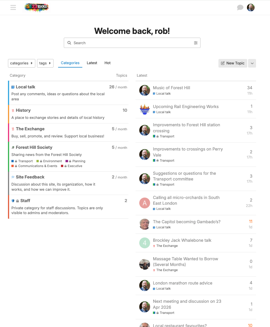
However, it does limit your ability to scroll through slightly older topics that may slip off the bottom.
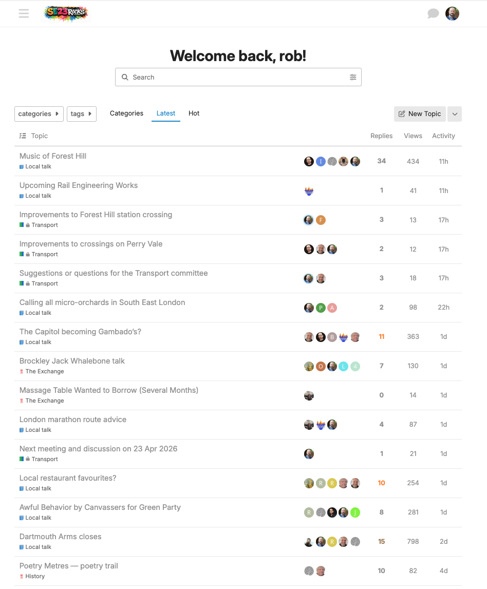
The alternative is to default to all the LATEST posts, and not show the CATEGORIES, like this:
You can always switch between them by clicking on the links above the listings here:
![]()
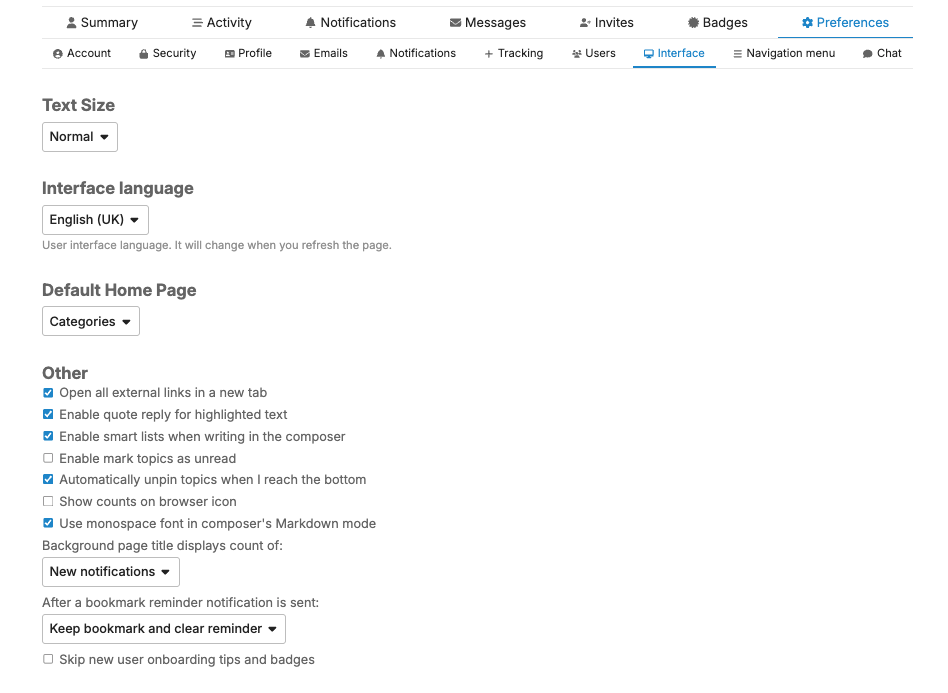
And you can even override the site default by telling the system what you prefer in your own preferences:
But, what would you prefer the default to be? Please vote below, and if you have any thoughts on this you’d care to share for discussion, please reply below
- Keep the current CATEGORIES display
- Show all the LATEST posts instead